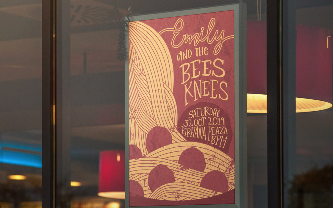
How do you get people interested in coming to your indie acoustic band’s grand debut at that run-down-but-still-trendy hole in the wall downtown? Create a poster that speaks comfortable and familiar, but with an unorthodox, almost edgy twist. That’s the feeling that Emily and the Bees Knees’ music carries.
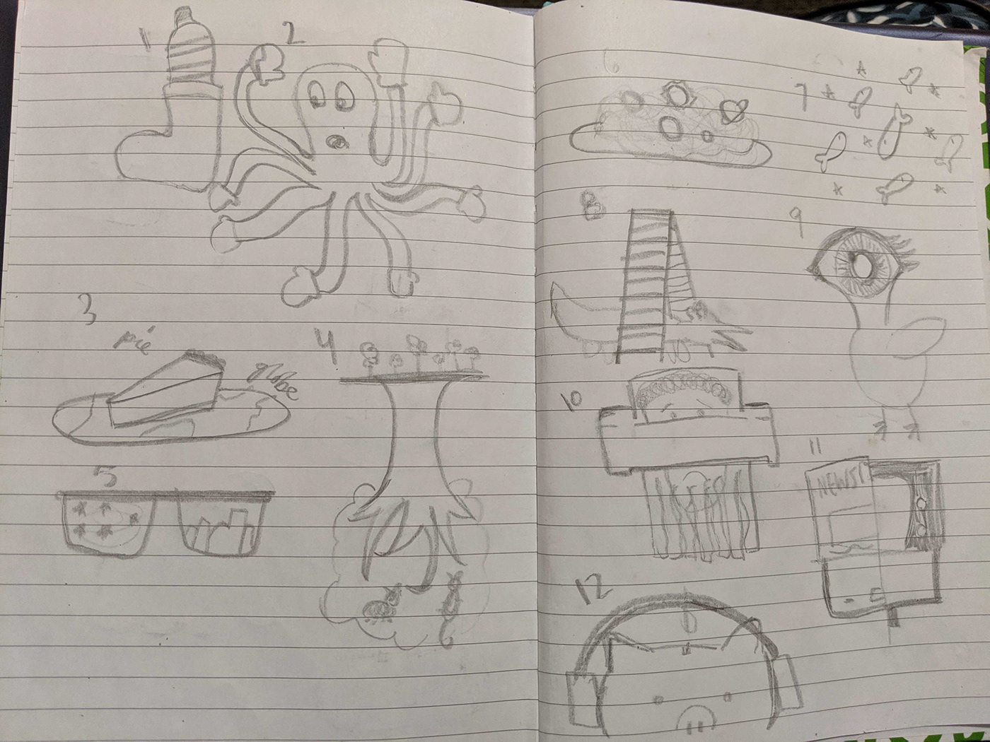
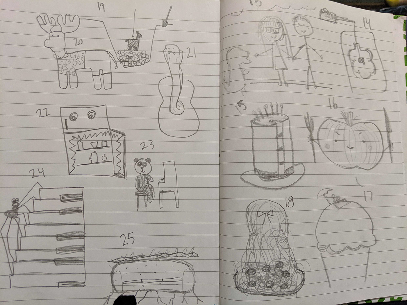
As I began sketching, I didn’t have a clear vision of where I wanted to end up. I wanted to take something traditional and familiar and find a way to combine it with something different or push it outside the box. I ultimately fell on the idea of a young woman’s hair turning into a plate of pasta — taking two ideas that by themselves are ordinary, and combining them in a way that can communicate the same vibe that the music gives.

I sketched and studied dozens of reference images to figure out how I want to create the hair. As I created my initial draft, the rendering of the hair was my first priority. Once I figured out a method in Illustrator using the blending tool, I went back to the sketch book!

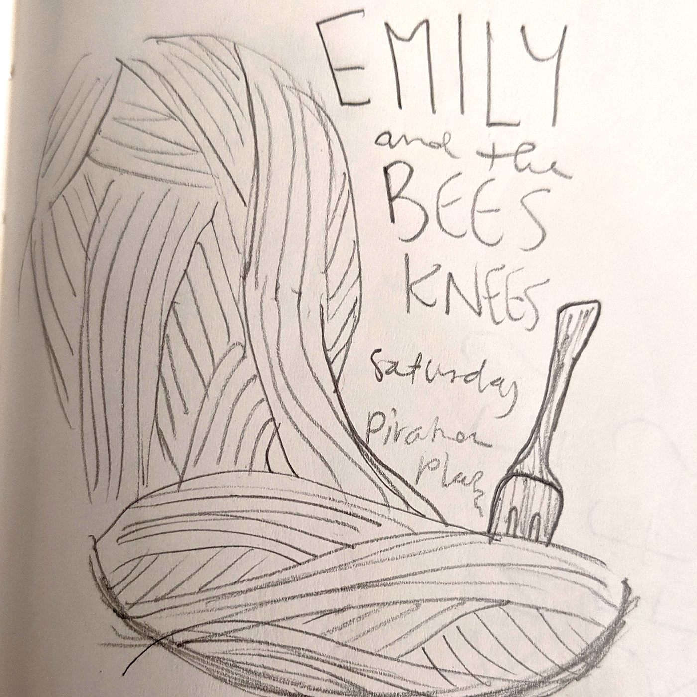
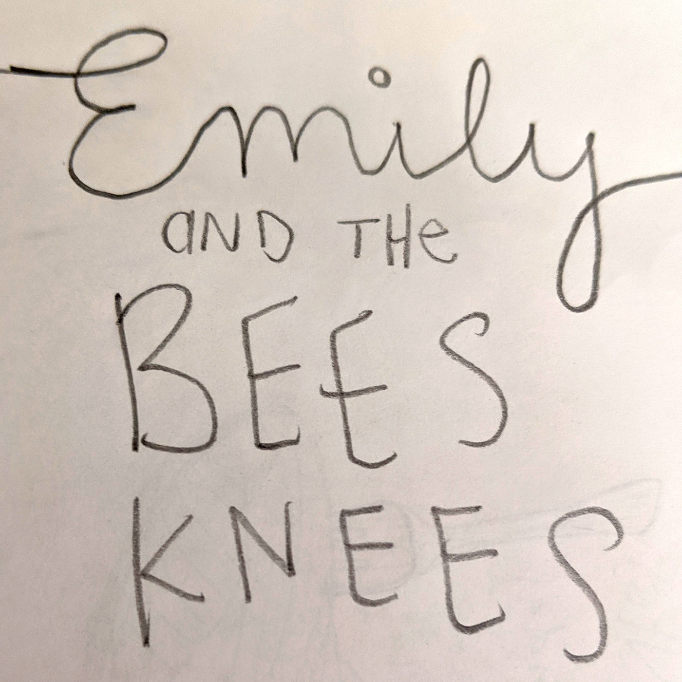
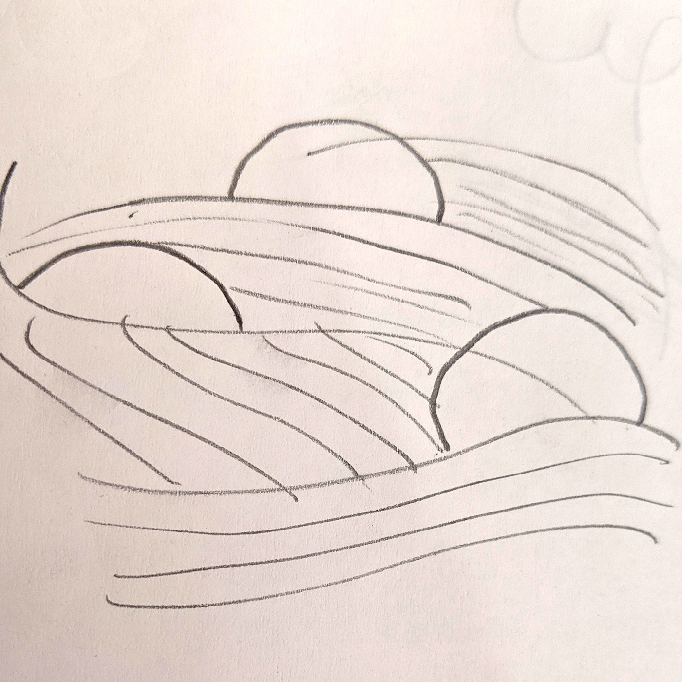
Once I’d settled on this concept, I began sketching. I really wanted to master how to capture the hair, and how to transition it into the pasta.

I got some really helpful feedback on how to refine the hair, and incorporate the meatballs into the concept so they aren’t just floating red orbs.


I continued to refine the flow and layout of the hair, and played with incorporating the text into a larger meatball to add cohesion to the composition. When I began adding this grunge brick texture to the poster, I also decided to opt out of using a perfect circle for the meatballs and created a more rugged/realistic shape. Now it was getting close. I also revisited the idea of using a bowl on the bottom to frame the rest of the poster after additional feedback, and it began coming together really nicely. I went through and ensured that each tangent was adjusted and all the grunge texture lined up precisely with the elements it was arranged over.

The final poster design is able to take something simple and traditional like spaghetti and meatballs and make you think about a little bit differently. Emily and the Bees Knees takes familiar musical concepts and does the same thing. The music appeals to a broad audience, but only a narrow group of them will grasp the deeper ideas. This poster causes it’s viewers to think “I wonder what they have to offer, and I’m excited to find out.”

