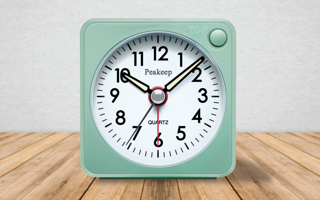
This was an exciting project to complete! My goal was to create a replica of this alarm clock as a vector, using light and shadow to communicate dimension and depth. Having a photo-realistic vector creates a lot of freedom, making this image scaleable for any number of projects!

As I began sketching, I focused on how to capture the highlights and shadows. dissecting the lighting on each different segment was so helpful in breaking down the clock as a whole.

I began the design process by laying down all the basic shapes I would be using. By focusing on the shapes first, it became so much easier to move from one element to the next, and I had a clearer vision of the work it would take to reach the end goal.

I received some excellent feedback after adding most of the shadows to the clock. I was encouraged to increase the subtlety of the shadows and highlights by blurring them and adjusting the opacity. It was also pointed out that there are different hues in the lighting, with blue on the clock face, and pink/orange on the outside lettering.

I continued to refine the lighting on the clock, until I found myself getting close. The inner casing proved to be the most challenging element of the clock, with so many intricate layers of lights and shadows. I added a subtle texture to recreate the texture of the plastic. I refined each highlight and shadow on the casing until I was satisfied that the design was entirely photo realistic.

I’m so happy with the final design. The lighting on the clock makes it look incredibly convincing. This clock in person is only 2 inches high, but this clock can realistically be scaled to any number of sizes.

