
This set of twelve temple icons was created specifically with young future brides in mind, to be incorporated into the interface of a wedding planning website for couples intending to be married in one of these temples. The goal of each icon is to communicate the beauty and simplicity of each temple. The architecture of temples has always impressed me. Each temple is unique, and yet they all have elements that unify them. These temples symbolize so much for individuals who believe that each temple is a house of God.
The Sketches
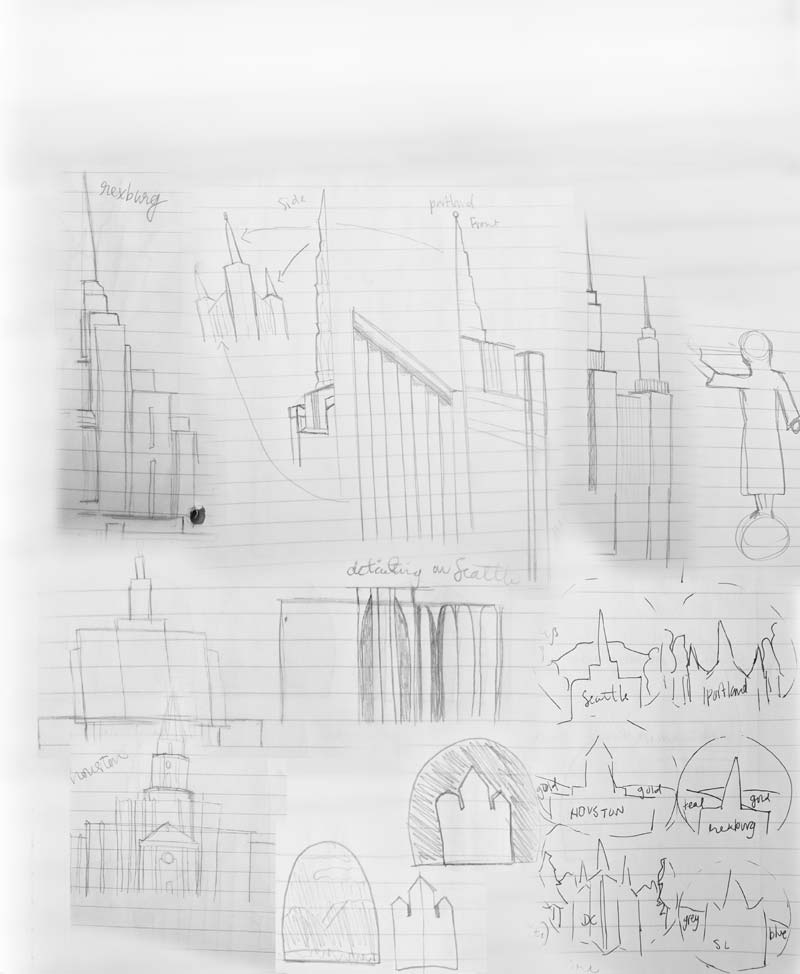
As I began sketching, I had a clear idea of what I wanted each temple to look like. I used reference images of each temple and really focused on dissecting the different elements of the temple. While I sketched, I realized I wanted some sort of background or container for the temple. I played with the ideas of an arch or a circle.
The First Draft
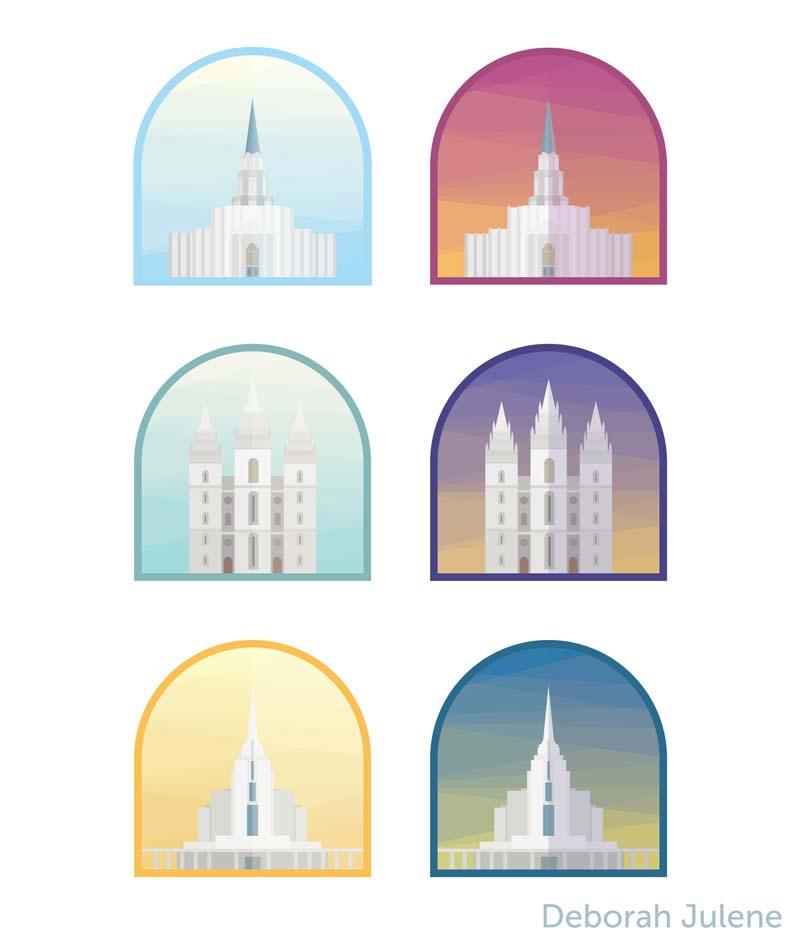
My initial draft placed each temple inside an arched silhouette, with a zig-zagging sky showing sunrise and sunset, each with a different color palette. I received some super helpful feedback regarding the continuity of the lighting, and the repetitive, overly-colorful backgrounds.

I adjusted, switching to a round silhouette with the temple extending outside the circle. Using that circle, I created a similar effect to what I previously used, this time with fewer colors and a consistent, round shape.
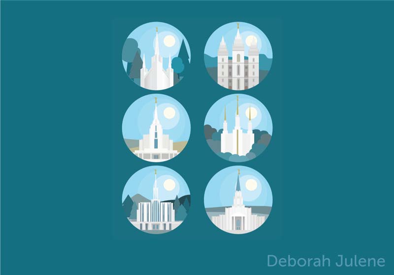
I took a sharp turn in a different direction, using only a few colors to indicate the sunlight. I decided to incorporate landscape backgrounds to reflect the location of each temple. The sun proved to be more of a distraction than an aid in this situation.
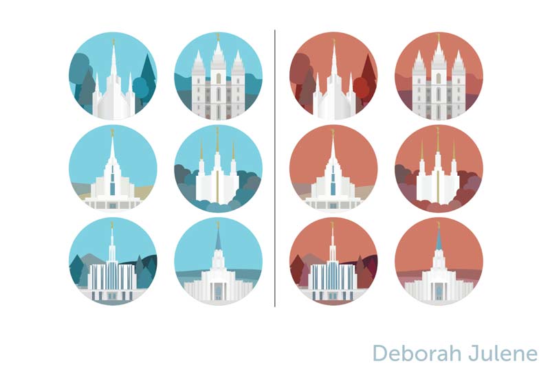
I removed the sun and instead focused on honing the lighting and shadows on each temple. I also decided to do a sunset orange background for the night-time set of icons.
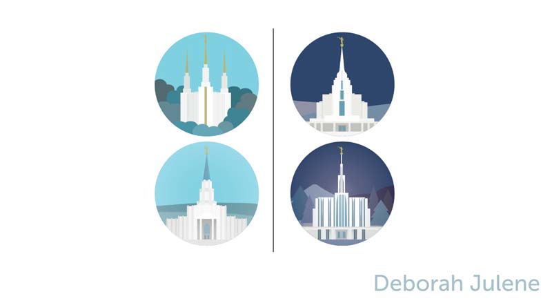
The orange wasn’t working. After playing with so many different colors, I settled in on a beautiful navy blue. This created a rich contrast between light and dark, and complemented the aqua used in the daytime icons. I also decided to use a really subtle glow effect. This elevated the design, communicating the clean, sophisticated vibe I was aiming for.
The Final Design
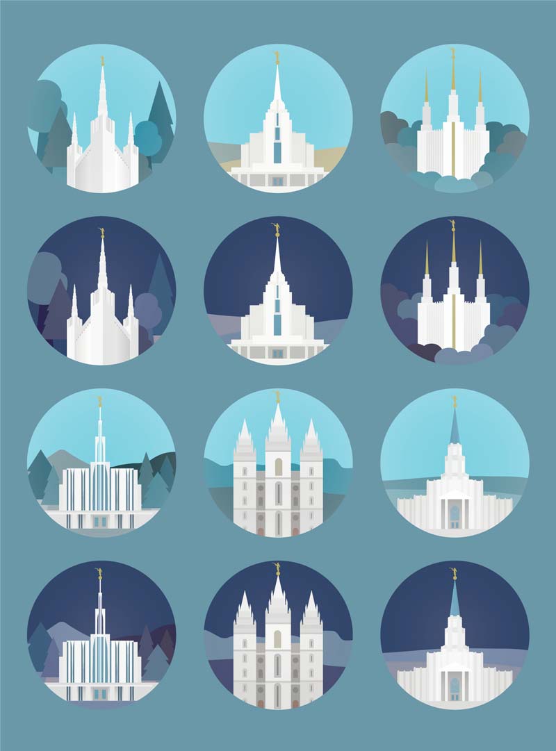
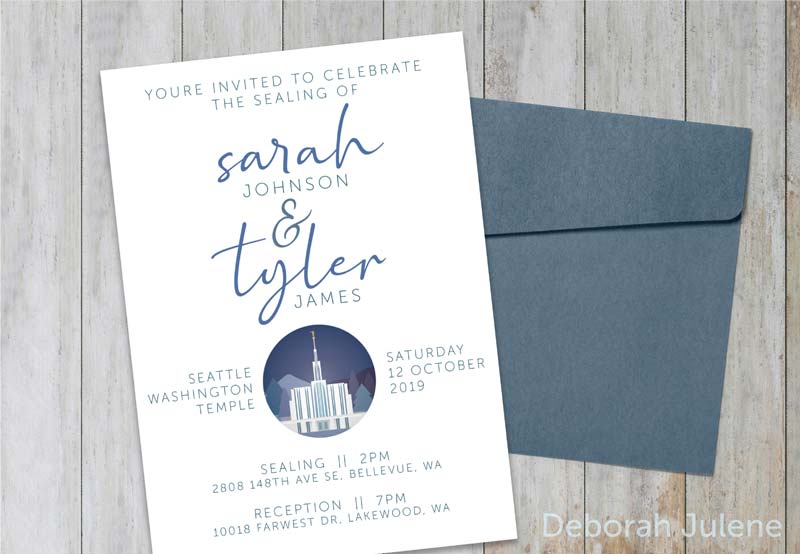

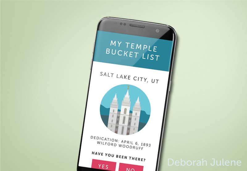
These temple icons take the complex beauty of each temple and communicate it in an extremely simple way. They’re easily recognizable to those who know what they are, and their application can be far-reaching. These icons could be incorporated in any number of ways into websites, apps, and even print mediums — all focused on helping people learn about and prepared for the great blessings temples can offer. View on Behance
